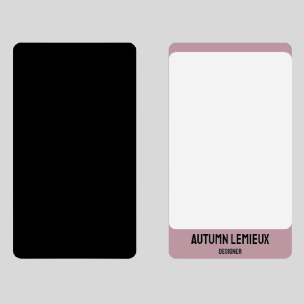
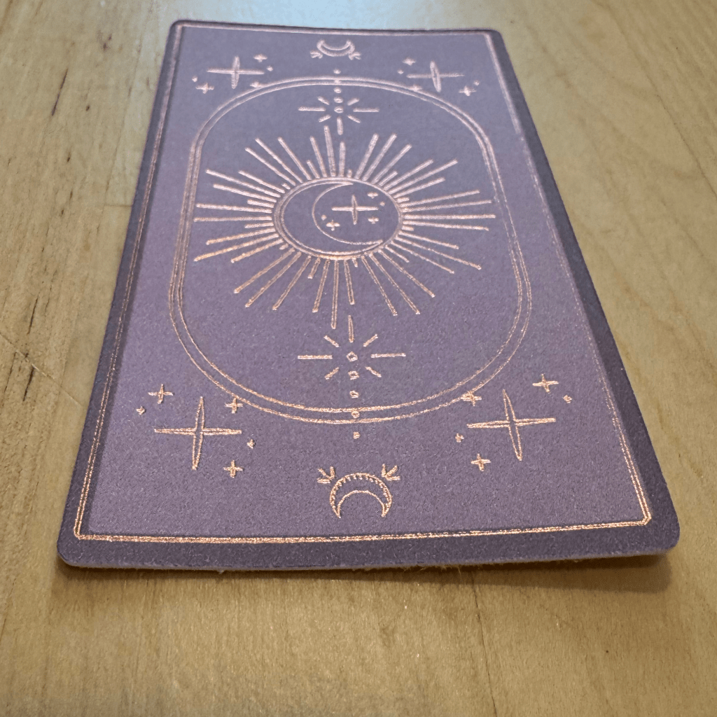
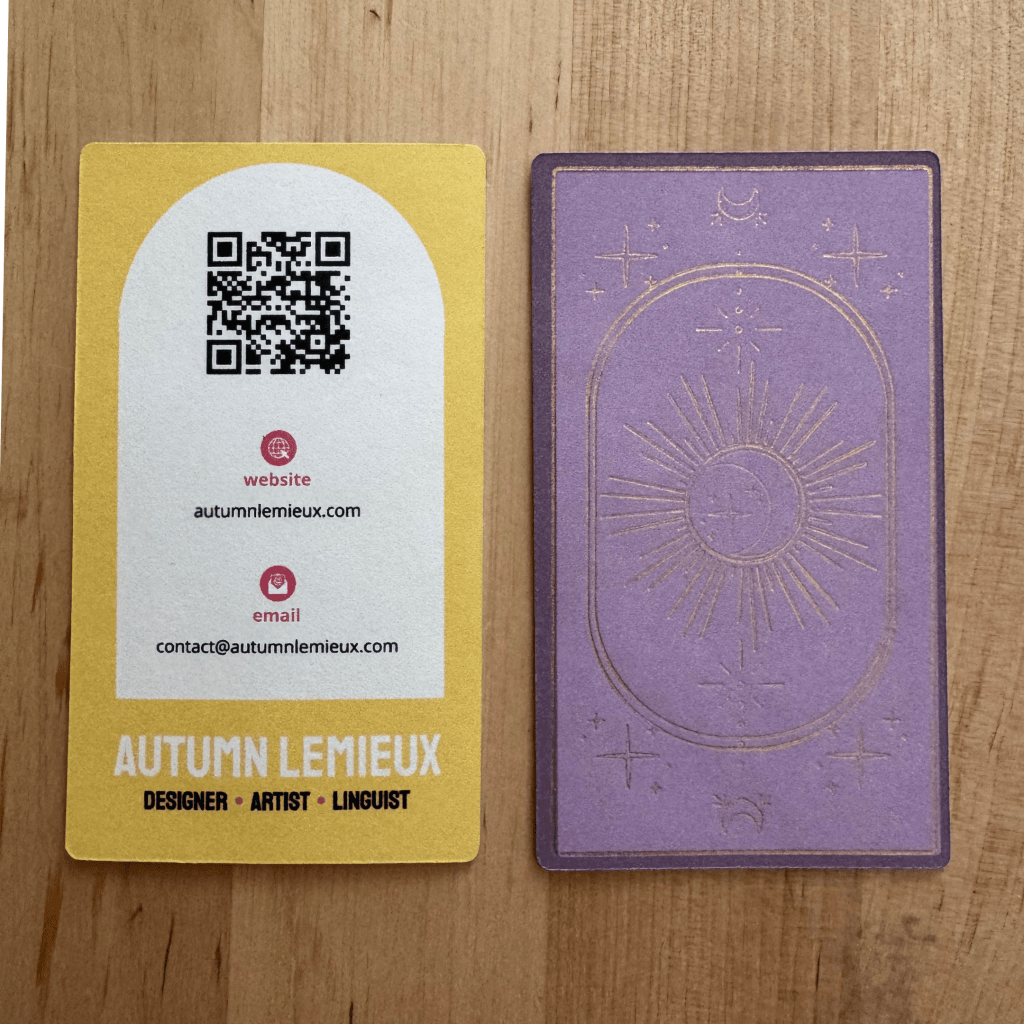
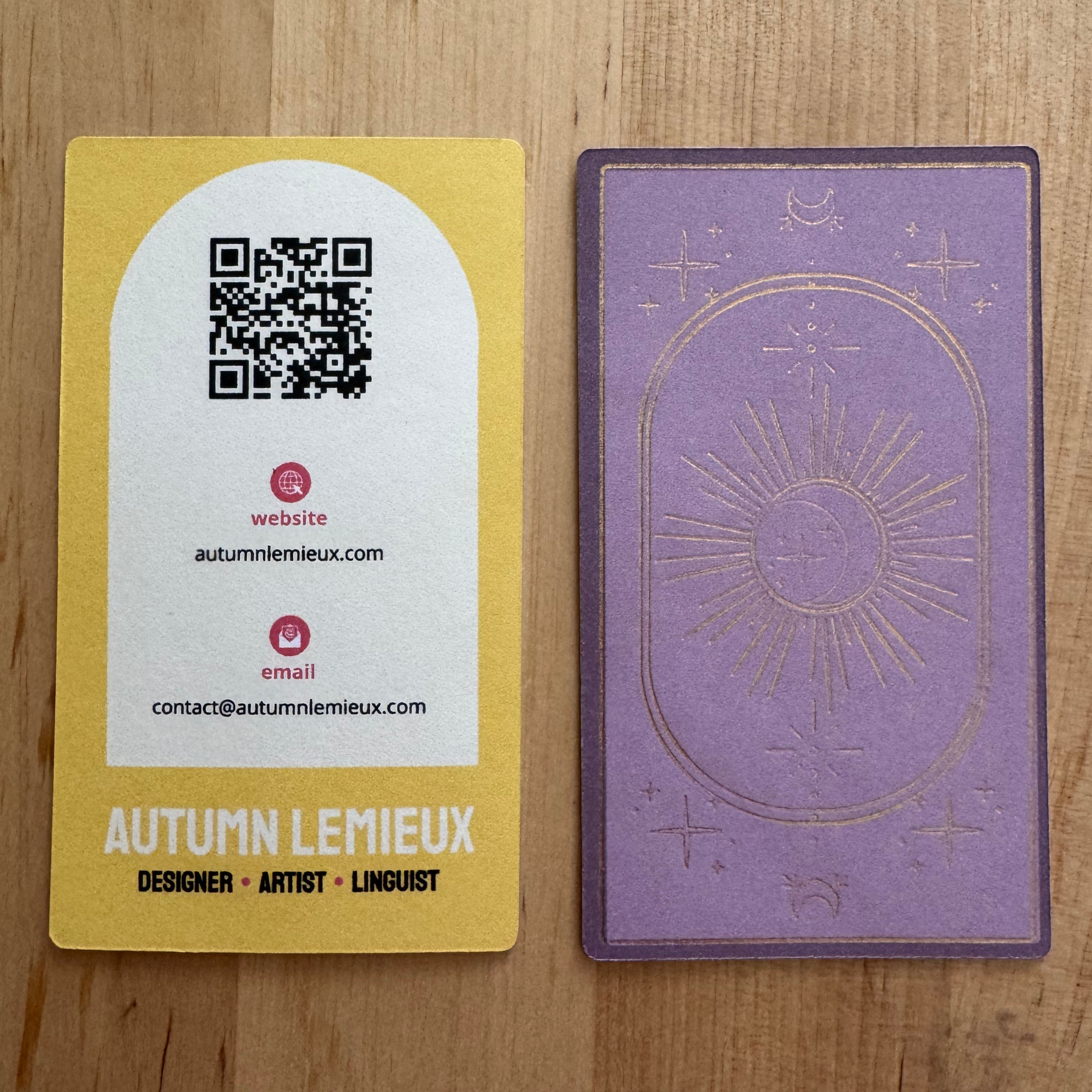
I had a fun realization recently—business cards and tarot cards have nearly the same size ratio. That inspiration, combined with the skills I picked up from other recent projects, led me to design my own business cards.
Brainstorming and Research
Business Card research
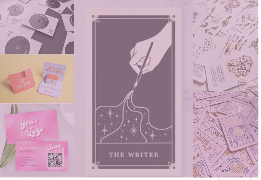
Before diving into the design, I took time to research business card layouts and industry standards.
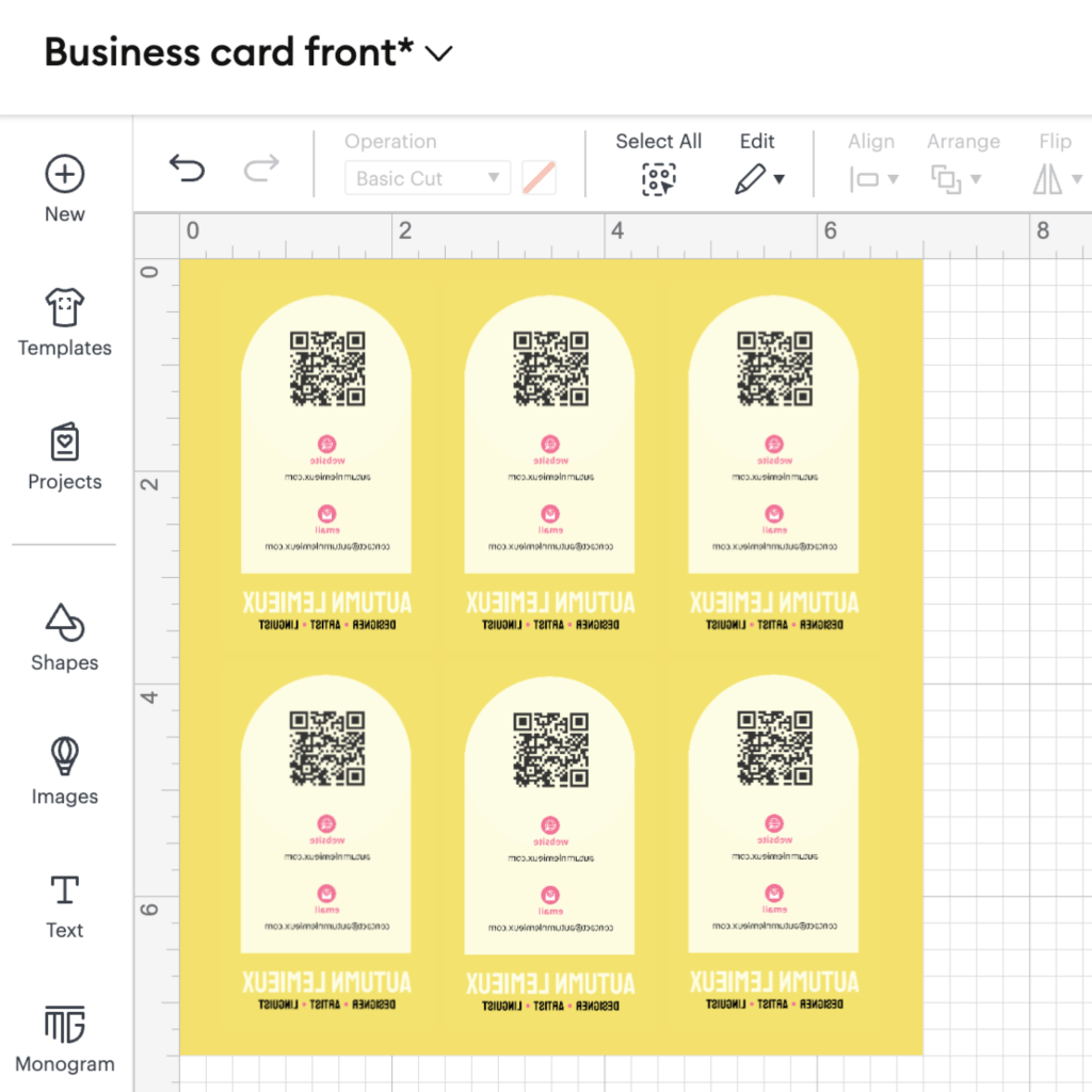
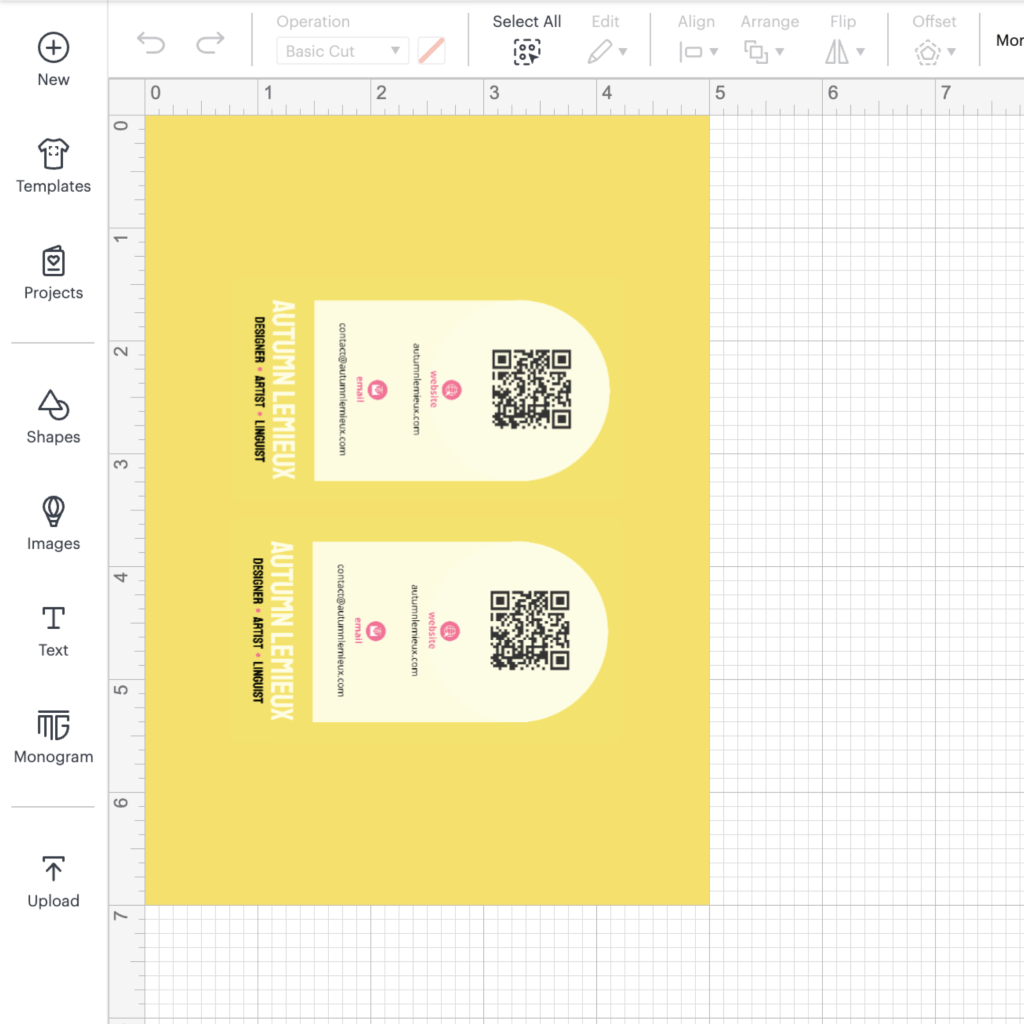
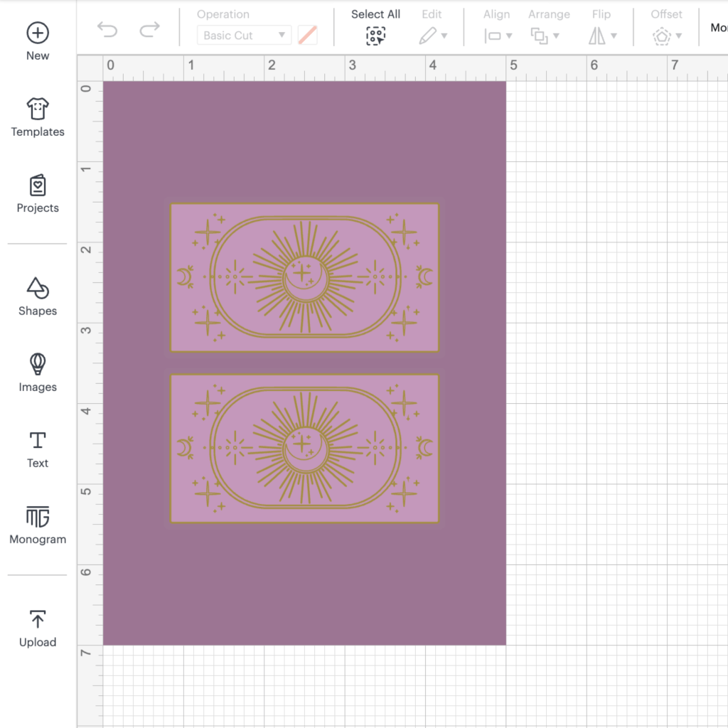
I decided on a standard 2″ by 3.5″ format with rounded corners, printed on white cardstock.
Brainstorming
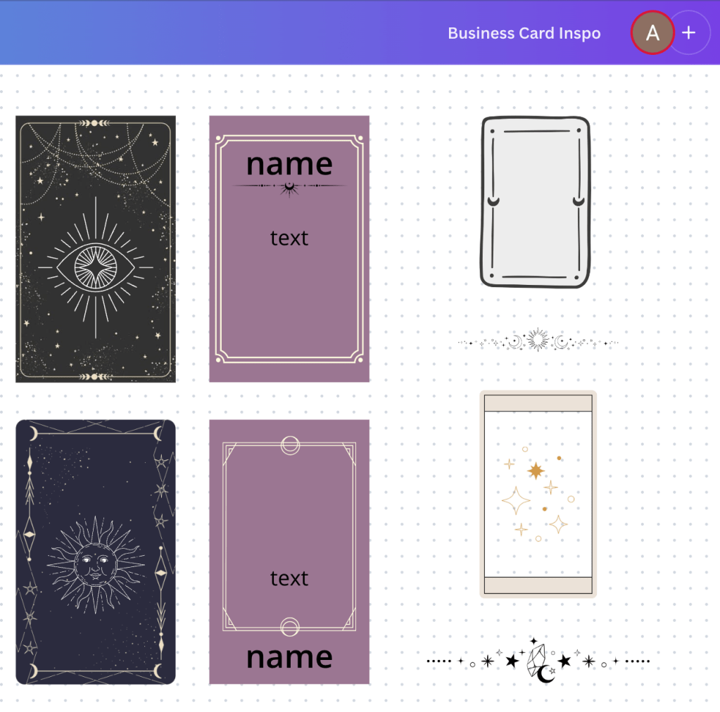
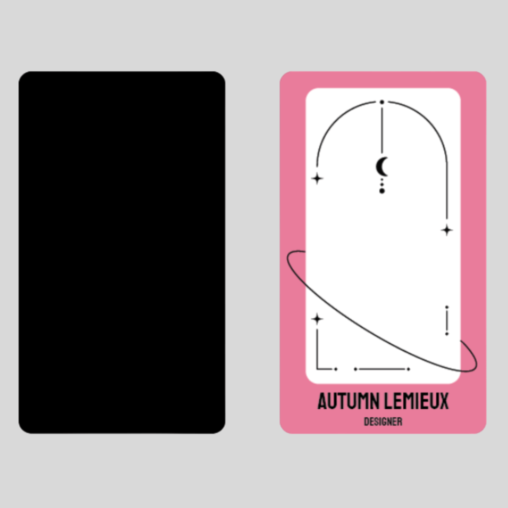
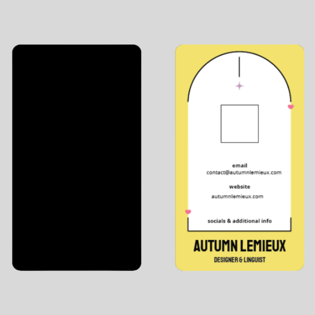
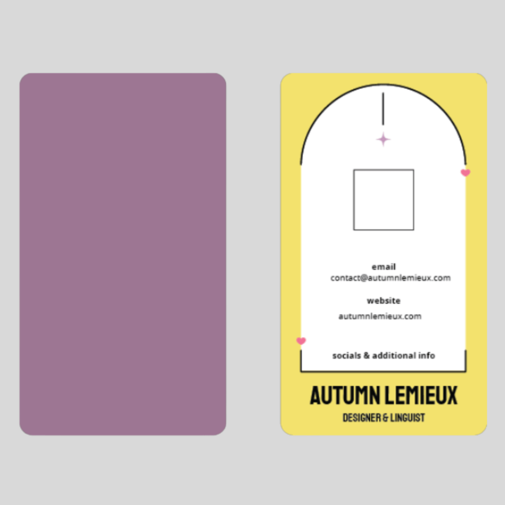
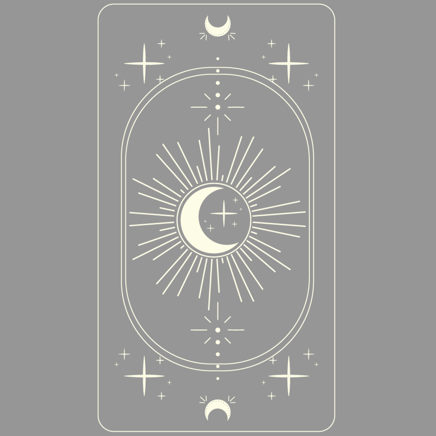
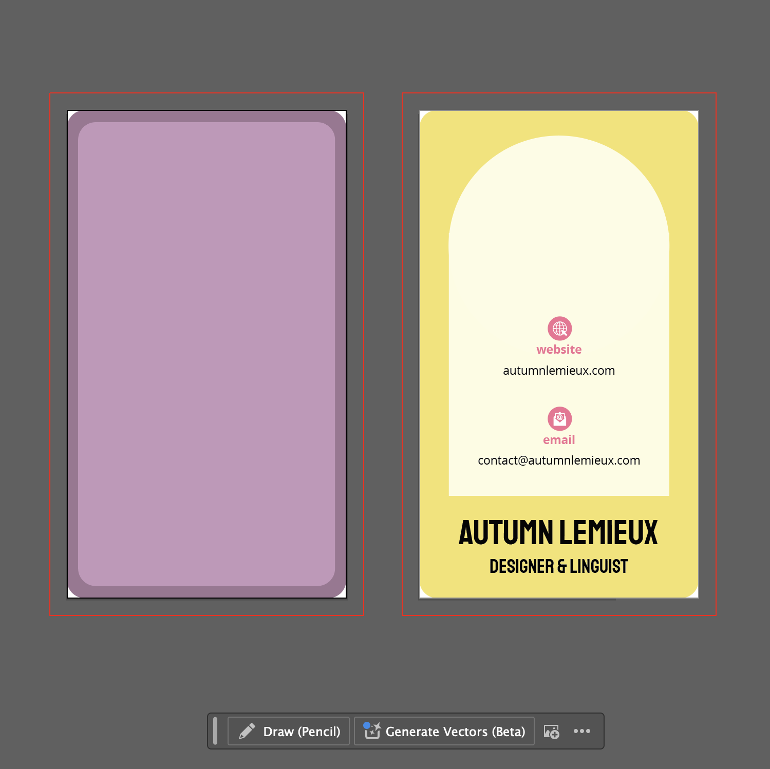
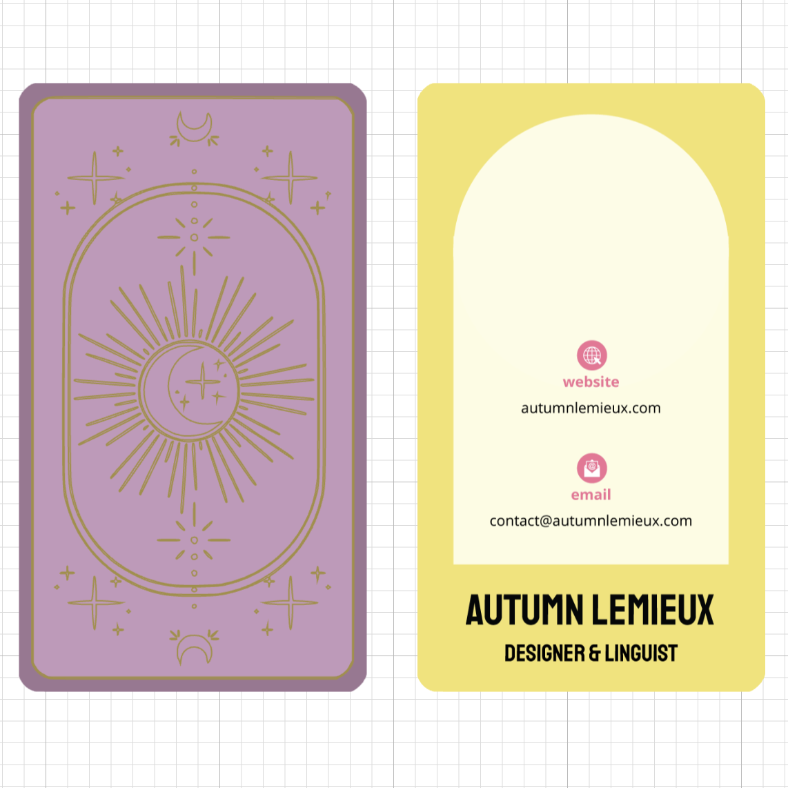
As I started creating mockups in Canva, I was thinking about how I wanted to incorporate tarot elements into my card.
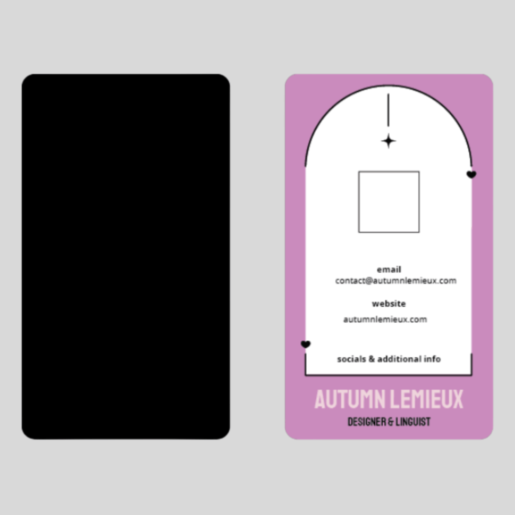
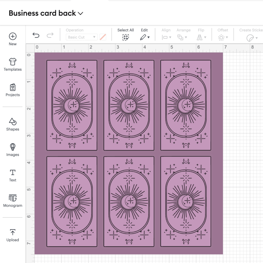
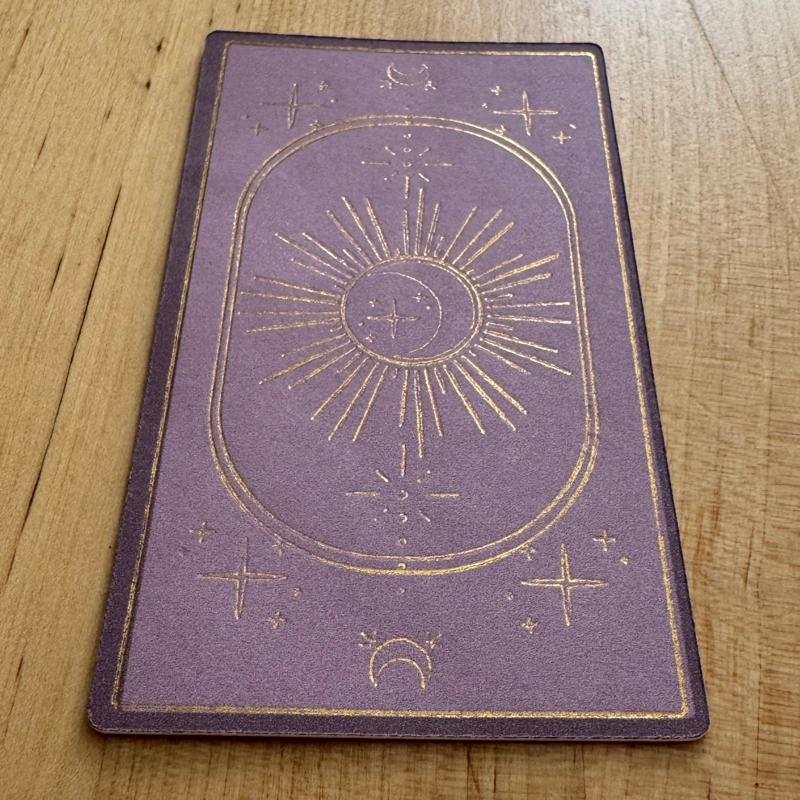
I ultimately decided to design my business cards with a tarot card back, keeping the front layout clean and structured. Instead of traditional card details, this side would display my contact information, mirroring how a tarot card presents its name and meaning. This approach allowed me to blend creativity with function, making the cards both beautiful and practical.
To elevate the design, I planned to add gold foil accents, creating a card that felt as intentional and magical as my other creative work.
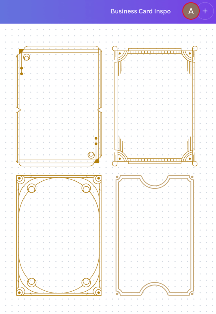
Designing
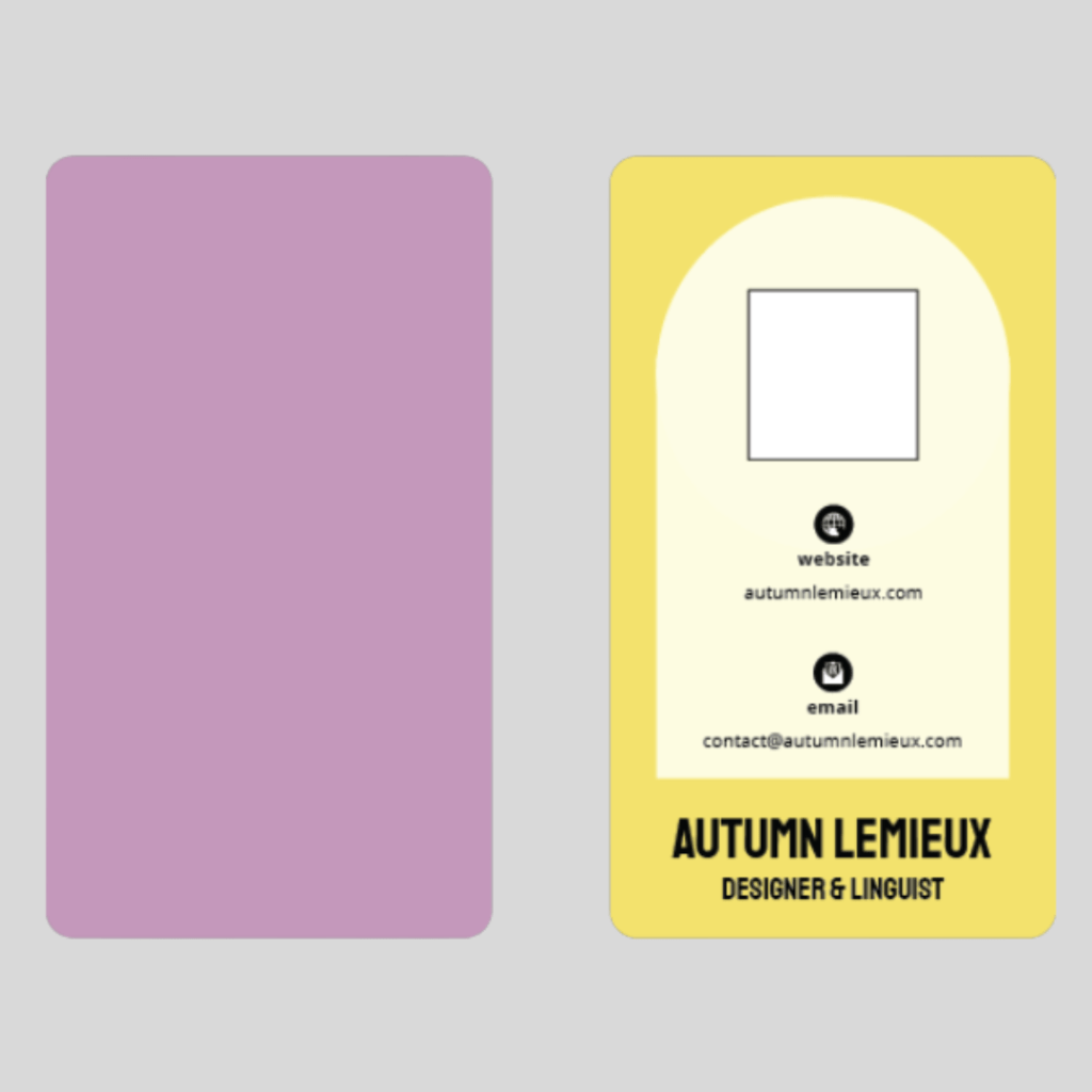
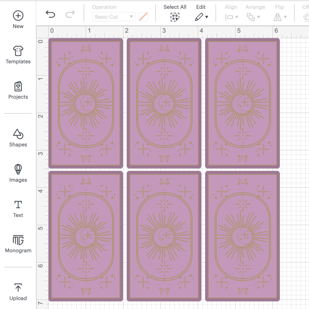
After experimenting in Canva, I used InDesign to create the print file.
I explored different layouts, typography, and visual elements that would reflect my brand identity. I wanted the design to be both functional and visually engaging, incorporating elements that felt uniquely mine. This stage involved multiple iterations—experimenting with color schemes, refining spacing, and ensuring the text remained clear and readable at a small scale.
Printing and Testing
Test 1
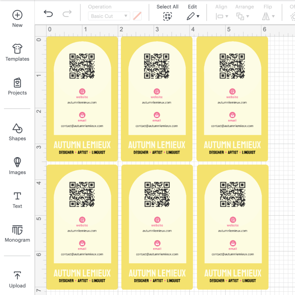
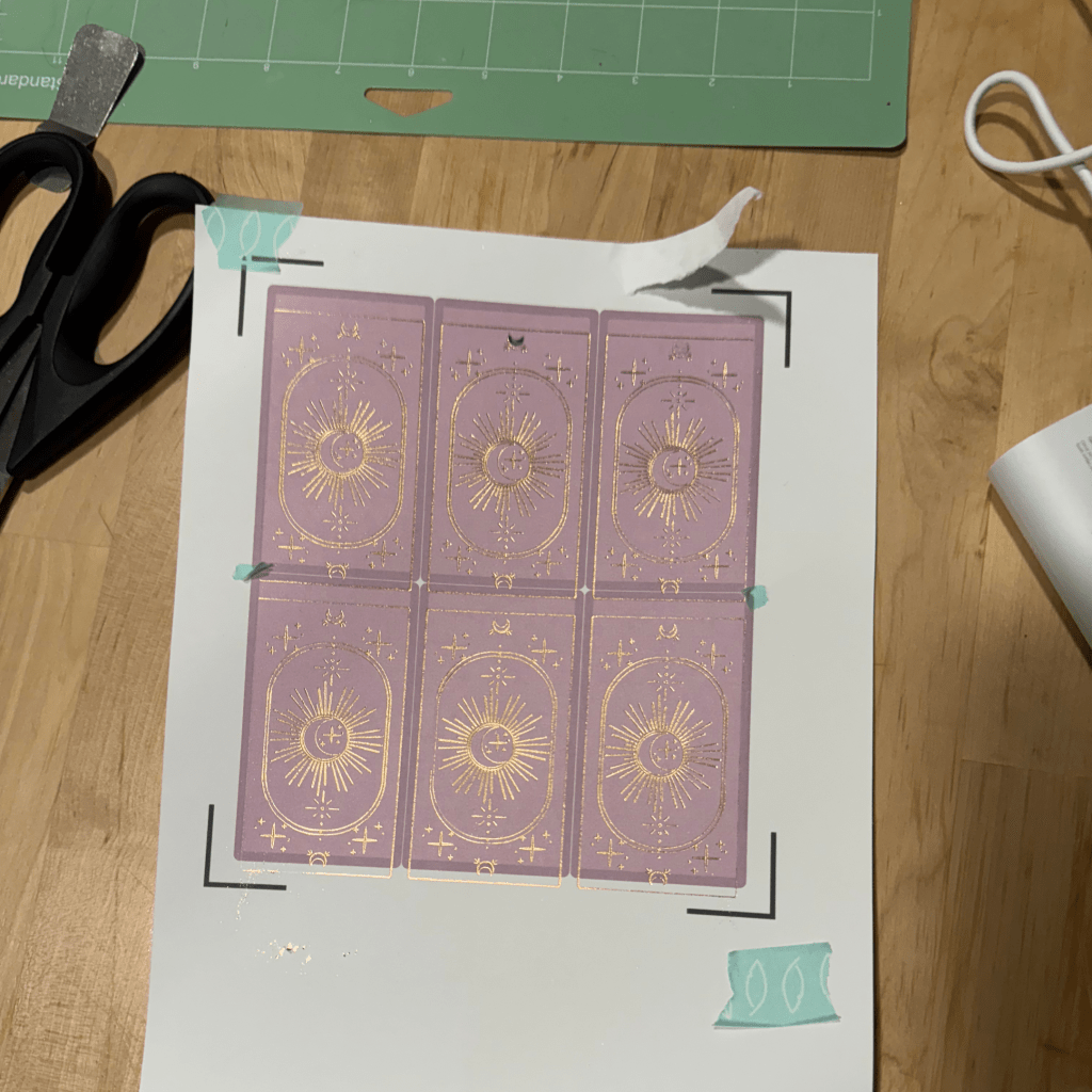
The first cut didn’t turn out as I’d hoped. Since I had printed at a lower quality to conserve ink for testing, I wasn’t too worried about the print clarity, except for the distortion around the QR code. However, I couldn’t figure out why the cuts were so misaligned at the time.
troubleshooting
While working on my MTG card redesign project, I finally realized what had gone wrong. Instead of relying on Cricut’s print then cut function, I had been creating my own cut templates to match my print files. Even though everything was properly aligned in InDesign, I hadn’t accounted for the various factors that affect Cricut’s cutting precision.
Using Cricut’s software turned out to be the better approach. It not only simplifies alignment but also allows for adding a bleed directly within the platform, eliminating the need to manually adjust it in the print file. This made my cuts and adding foil a much smoother process.
After realizing print then cut was a better choice for this project, I made a few modifications to the design and brought it into Cricut.
Foil Transfer Decisions
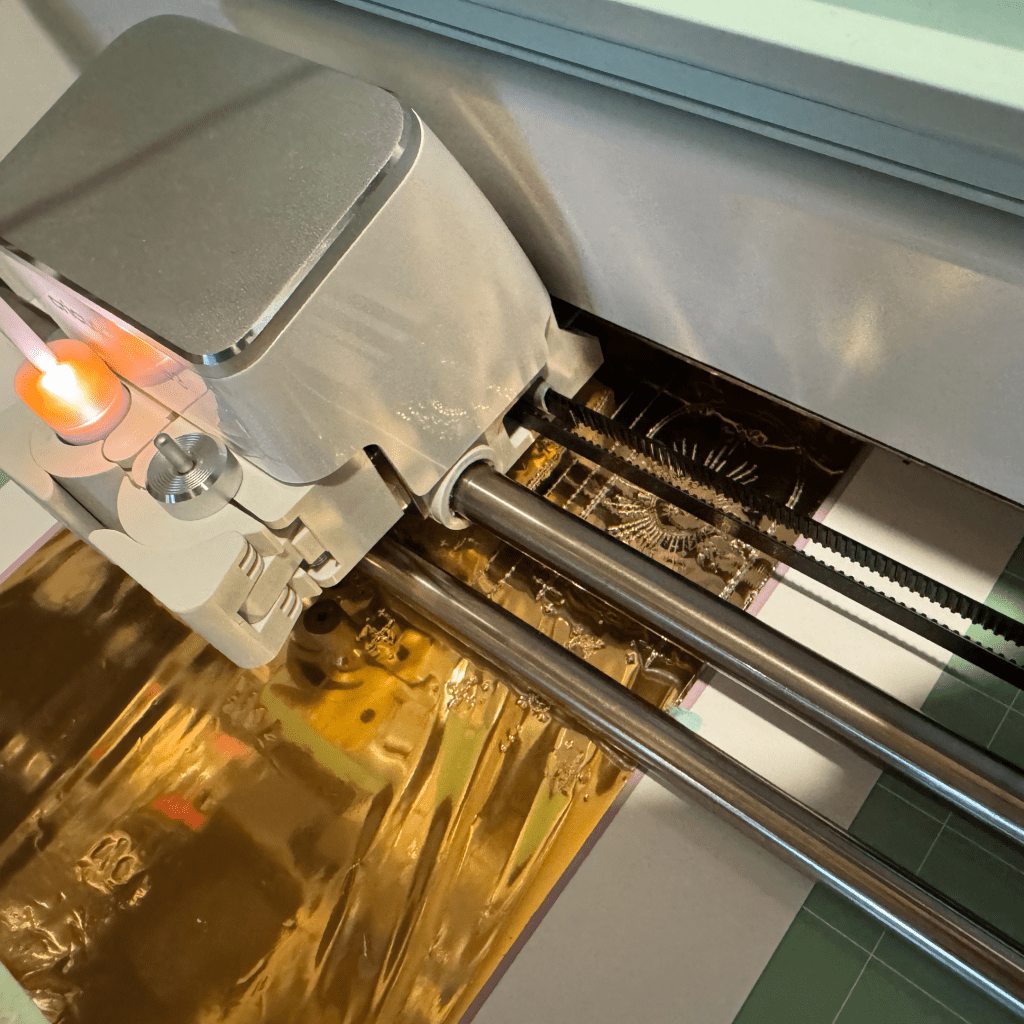
Once my printing and design challenges were solved, I had to learn how to use transfer foil on my Cricut. This is something I attempted for my bookbinding projects but haven’t quite gotten the hang of.
I experimented with two different foil types and tools: the Cricut Foil Transfer Kit and a heat foil quill kit from We R Memory Keepers (WRMK). After an initial test and a complete fail with the Cricut foil, I proceeded with the WRMK foil quill and planned to return the Cricut kit.
Pros
Cons
Cricut Foil Transfer
- Affordable foil sheets
- Sheet format and sticky tabs made application easy
- No tool troubleshooting was required for me, as it’s specifically designed for the machine
WRMK Foil Quill
- Improved adhesion and durability thanks to the heat transfer
- Enhanced clarity with a more vibrant, shiny finish
Cricut Foil Transfer
- This is a pressure transfer, not a heat transfer, so rubbing on the design removes some
- My sheets were only 4″ by 6″, meaning I can only make 2 cards at a time! However, they do come in 12″ squares.
WRMK Foil Quill
- I had some challenges in choosing the right settings for this foil. In the final product, I loaded the quill in slot B and ran the design as a drawing
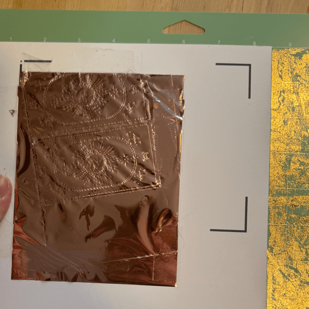
- The foil rolls were challenging to cut and work with
Test 2
For my first foil run, I decided to try out the WRMK foil quill. I was intrigued by the idea of heat transfer foil having better staying power, as I wanted these cards to be durable. As noted above, I had some issues with cutting this foil and things were quite misaligned, but the Cricut foil didn’t transfer well on my first try.
After many attempts with the foil quill, I switched from gold foil to rose gold. One issue I had was trying to create too many cards at once; the foil roll’s length of 6″ was not enough to span the distance of three cards with enough coverage. If things weren’t already completely misaligned, only one or two cards were turning out well.
Test 3
Final Test
Test 4
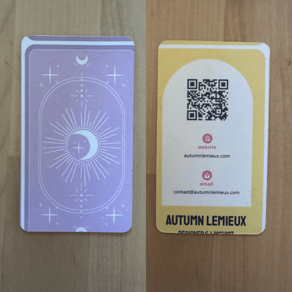
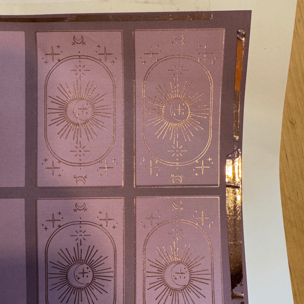
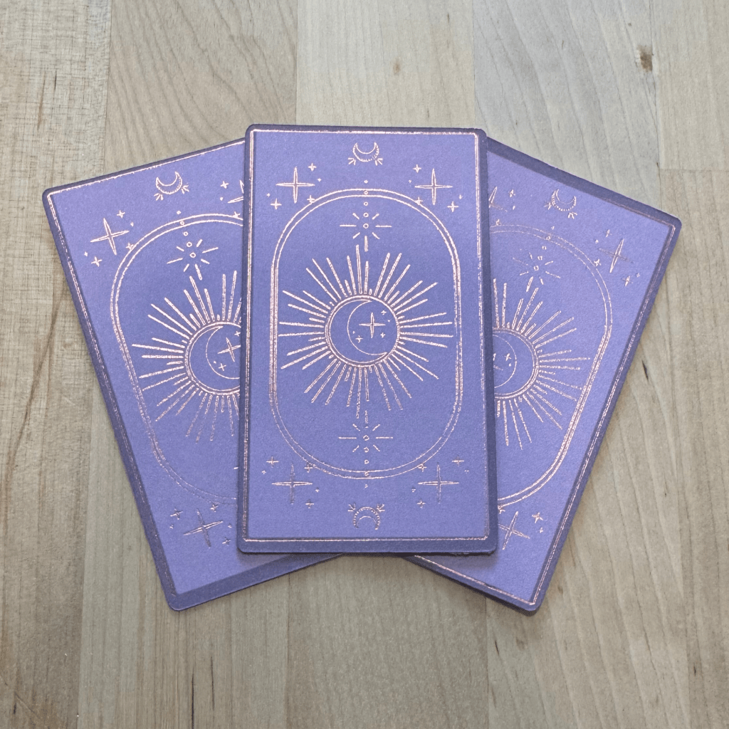
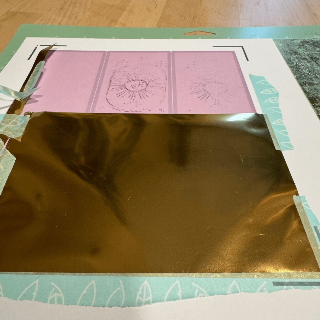
Running low on gold and rose gold heat foil, I switched back to the Cricut foil, changing from a fine-point to a medium-point transfer tool. I also selected “more” pressure, keeping in mind that this is a pressure transfer foil. This iteration turned out much clearer, and I actually preferred the subtlety over the heat foil. Additionally, applying the foil sheets to the design was much easier than cutting from a roll.
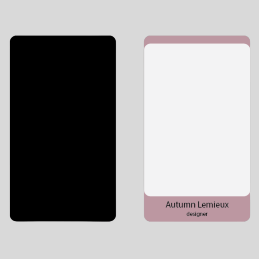
Tests 1 through 3 were done on medium and heavy-weight cardstock, but printer alignment issues with the heavy cardstock caused misalignment on the front, even when the foil and back were perfect. I didn’t want to hand out low-quality cards, so I printed each side separately on thin cardstock, which improved alignment and allowed me to correct any issues when gluing the halves together.
Though the thin cardstock made removal from the Cricut mats tricky, I was happy with the results. To adhere both sides, I used Elmer’s Craft Bond spray adhesive. The final step was to cut foil-side-up with the Cricut on the heavy cardstock setting.
Concept vs. Product
Bringing an idea to life always comes with twists, turns, and plenty of learning.
I’m excited to have gained a deeper understanding of creating print products with the tools I have—and I think I’m close to mastering foil transfers!
I also loved the chance to translate my website branding into a tangible print piece while building on skills from past projects.

Next Steps & Final Thoughts
Seeing the final business cards was a full-circle moment, bringing together skills from various projects into a cohesive and practical design. To me, this process reinforced the idea that design is more than aesthetics—it’s about problem-solving, iteration, and effectively communicating a vision. This also reinforced my love for thoughtful, intentional design, and I look forward to finding new ways to apply these skills in meaningful and impactful ways.
Moving forward with this project, I’d like to try out another version with the larger sheets of Cricut foil. I think I’m on the right track with including more print space for the foil sheet to overlay so the Cricut can sense things properly.

You must be logged in to post a comment.