Whether you’re a longtime player or just admire the art, each Magic: The Gathering card tells a story. That’s what makes redesigning MTG cards such a fun creative project.
If you’re thinking about customizing cards, here’s my process and what I’ve learned along the way.
Planning
Why redesign?
There are a few reasons you might want to redesign a card:
- Alternate Art
- Keep the card’s mechanics the same while refreshing its visual presentation. This could mean swapping out the artwork or creating a borderless design.
- Custom Mechanics
- Ever wish a specific card existed? Now it can! When designing a custom card, you can create entirely new abilities or tweak existing ones while staying within MTG’s established mechanics.
- Thematic Consistency
- Build a set with a cohesive artistic or lore-driven theme.
I’m designing alternate art cards, sometimes with thematic consistency.
Materials & software
I print and cut my designs myself, which keeps costs low since I already own a Cricut and a high-quality printer. If you’re starting from scratch, investing in the right tools can be pricey, but it pays off in creative freedom.
For software, I started with Photoshop, InDesign, and Canva, but I ultimately found Card Conjurer to be the best tool for MTG card creation. It allows for precise layering and easy import of official card details. I’ll talk about Card Conjurer more in a later section.
Understanding the Art and Details
MTG cards have evolved over time, featuring a variety of styles and borders across different sets. Most cards follow a standard format: a framed design where half of the card is dedicated to artwork, while the other half contains text and gameplay details. However, not all cards adhere to this structure.
The Details
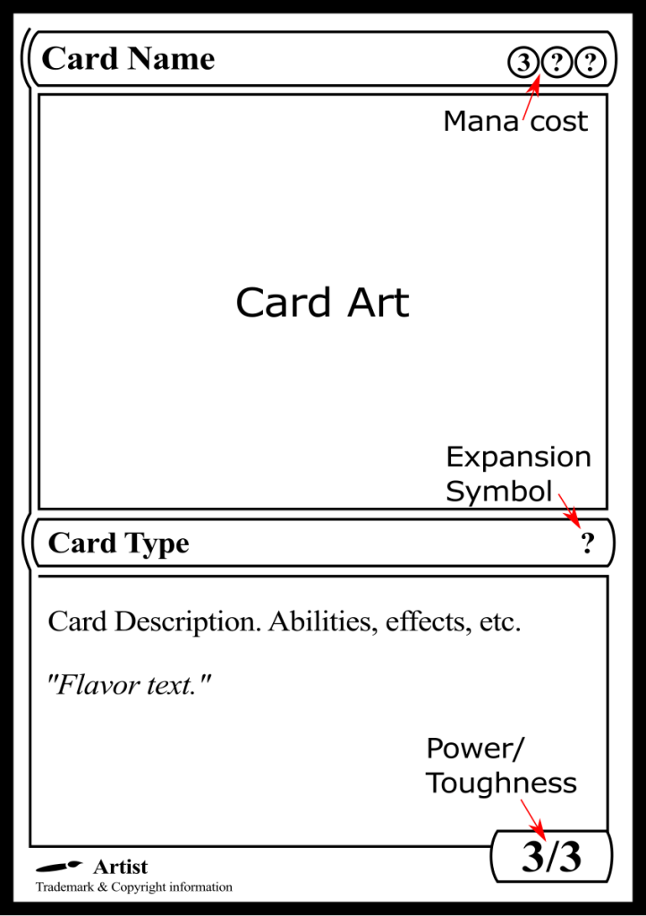
Skipping the small details can make a custom card feel less realistic. When I design cards, I focus on preserving the integrity of the information while enhancing the overall art and design. Here are a few key elements I like to modify:
Expansion/Set Symbol
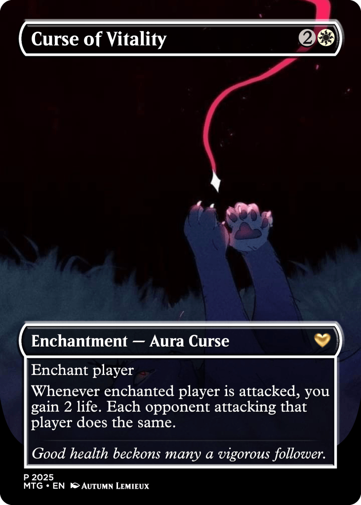
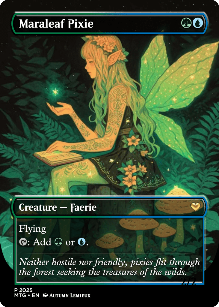
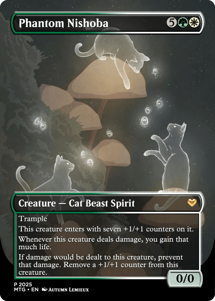
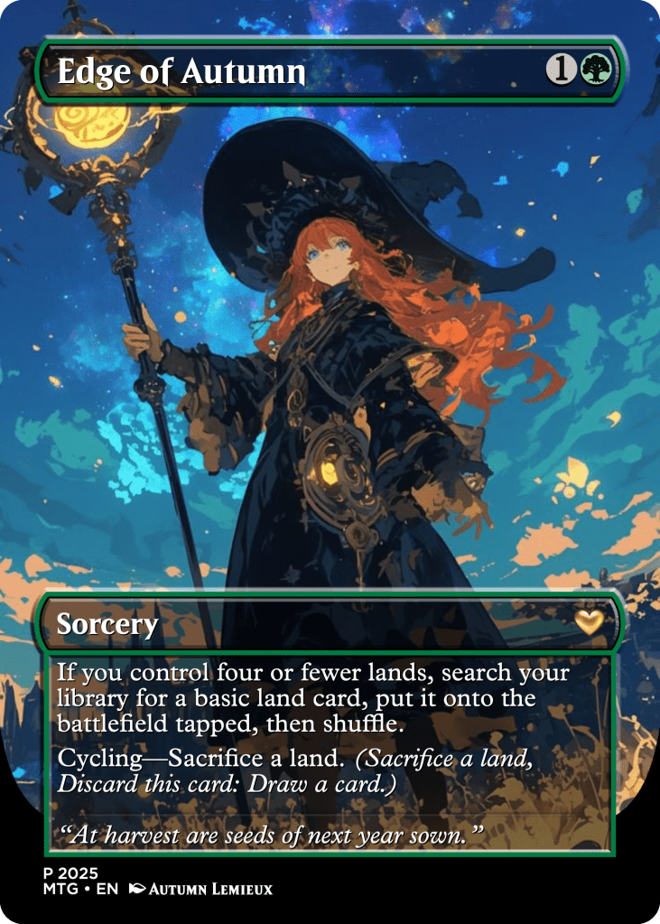
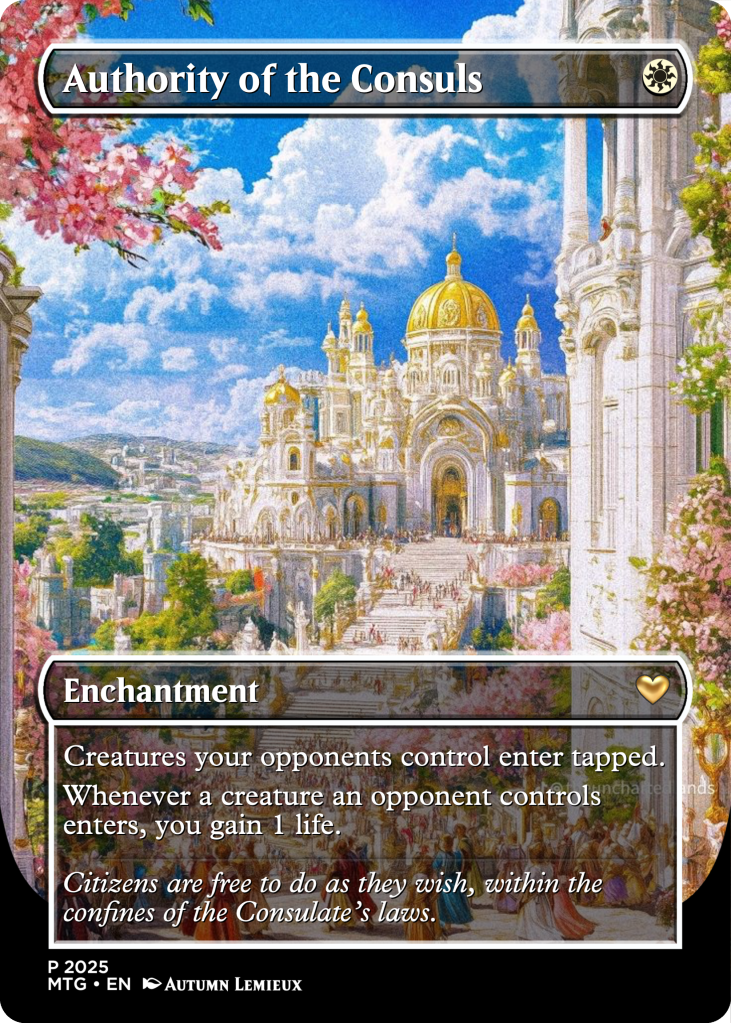
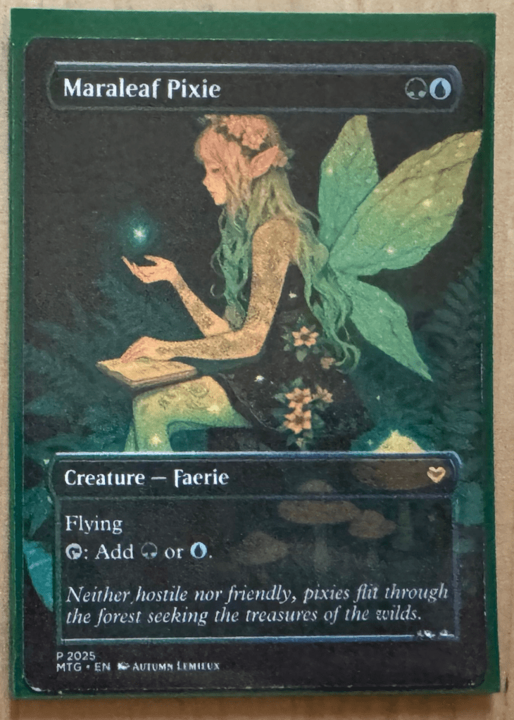
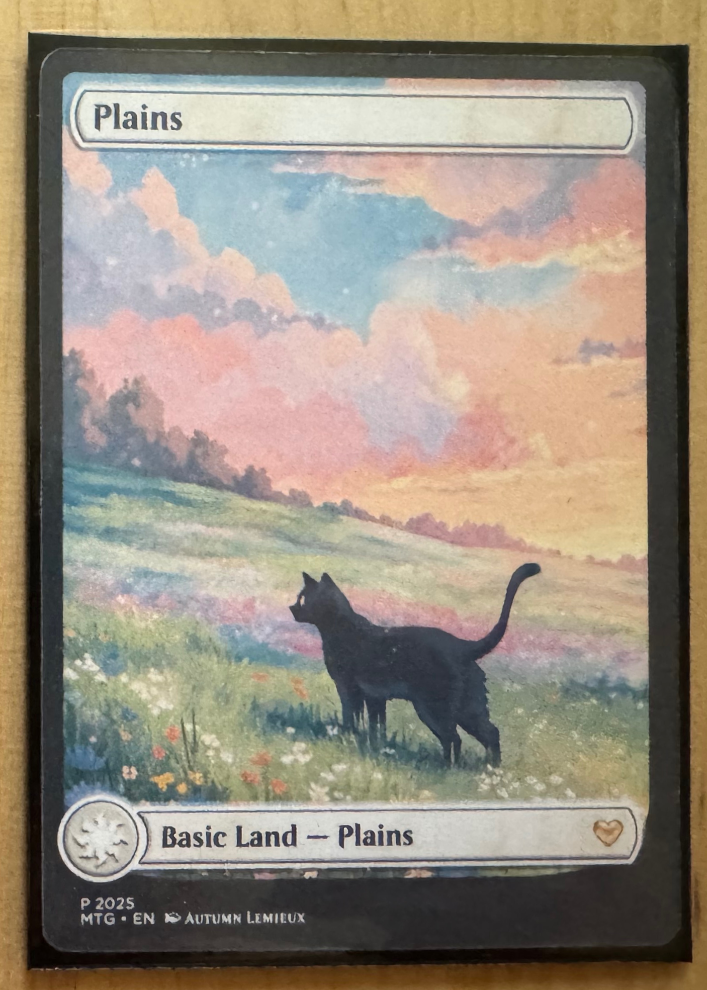
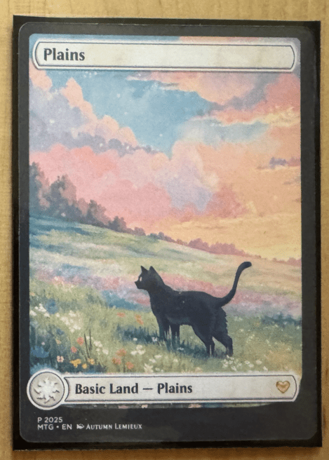
I created a gold heart icon for my custom cards, but you could use a symbol from your favorite set or design one that fits your theme.
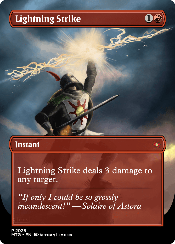
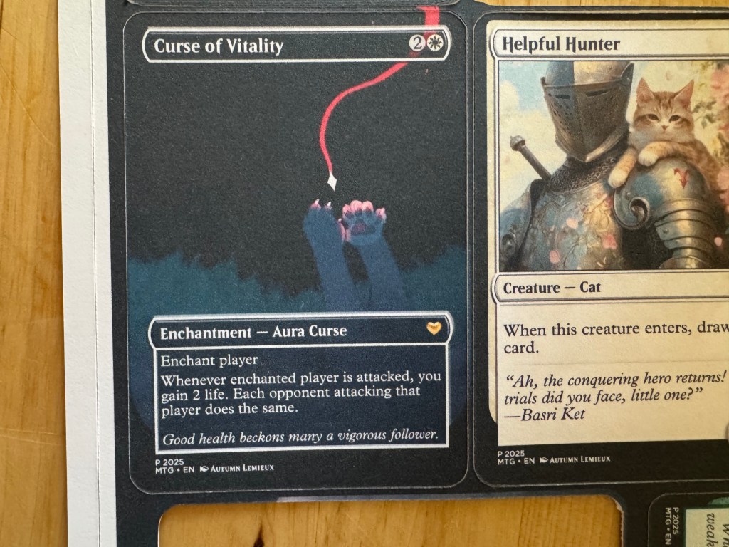
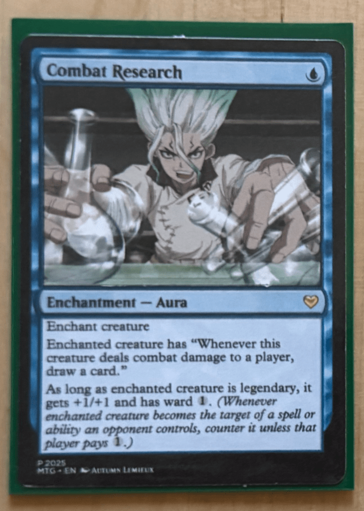
Flavor Text
Along the way, I learned the official term for the italicized quote at the bottom of some cards: flavor text. It’s a small but fun way to add extra personality to a themed design. You might’ve spotted this in my Lightning Strike x Dark Souls redesign above.
Artist
I think it’s fun to add your name to the cards you create, especially if it’s a gift. It makes the card feel even more personal and unique.
Border and art Styles
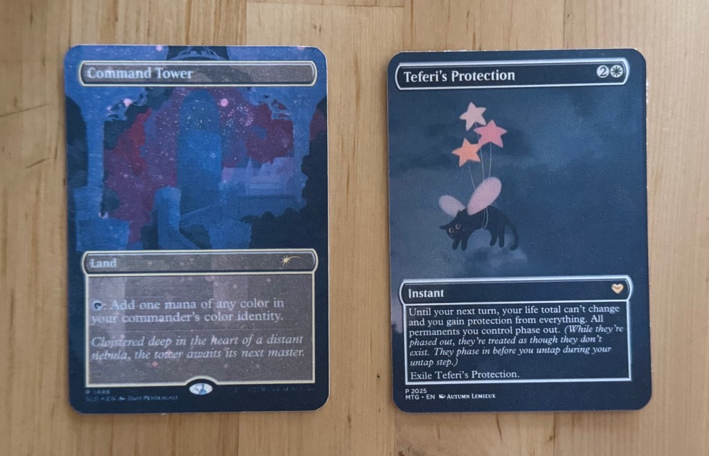
One of my favorite styles to create is borderless cards, which break away from traditional framing for a more immersive design. Take a look at the examples below!
Border colors typically reflect mana cost.
- A green and blue card might have a green/blue split border.
- A red card will likely have a red border.
- Artifacts and vehicles have their own border types.
Borderless cards kind of have a border.
- While borderless cards don’t have a traditional frame, they still technically feature a border. If you look closely at the cards above, you’ll notice a thin pinline border around the card name and text box.
Thematic elements enhance the design.

- Plains (White) – Order, peace, and light. Bright, airy imagery with florals and light beams.
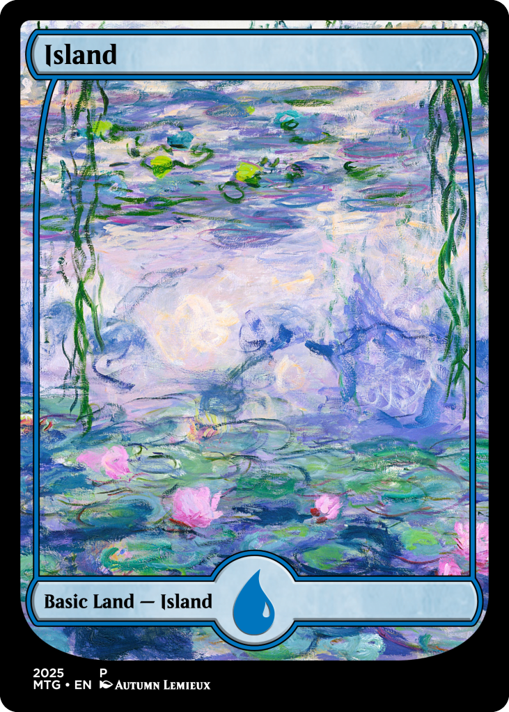
- Islands (Blue) – Intellect, logic, manipulation, and trickery. Watery, serene visuals.
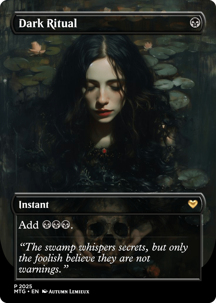
- Swamps (Black) – Power, death, corruption, and sacrifice. Dark, eerie landscapes.
- Mountains (Red) – Freedom, chaos, fury, and warfare. Rugged, volcanic terrain.
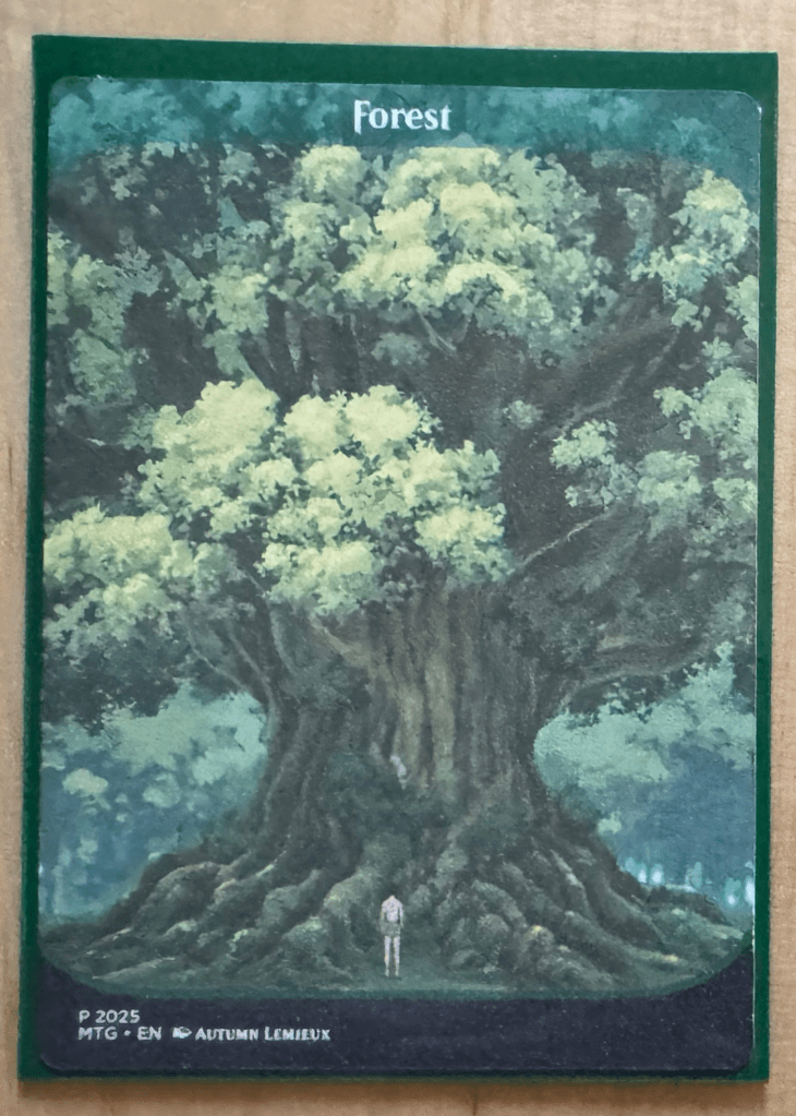
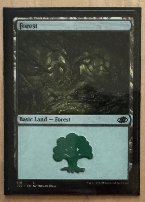
- Forests (Green) – Life, nature, evolution, and indulgence. Dense foliage and vibrant greenery.
When designing, I try to choose artwork that aligns with these themes, ensuring each card stays true to its identity. For example, if you look at the first and last cards—Dark Ritual and Authority of the Consuls—you’ll see they fit well within their respective colors’ thematic elements.
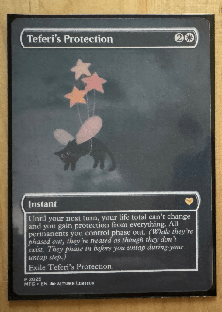
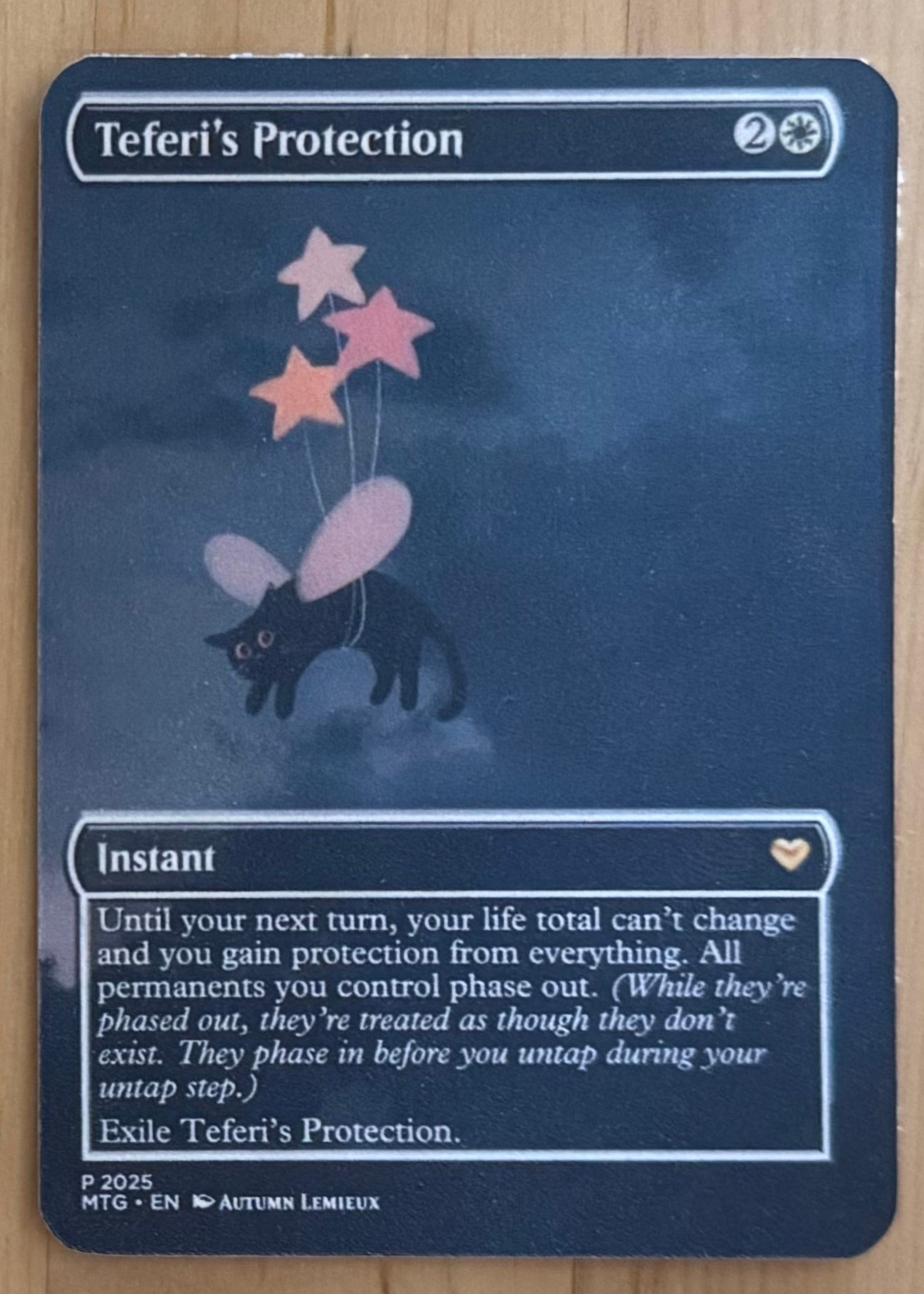
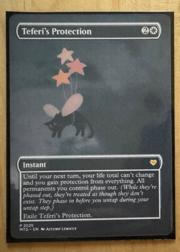
I did step away from this guideline with the middle three cards (Teferi’s Protection, Phantom Nishoba, and Edge of Autumn) because they were designed for themed decks, and I intentionally altered the art to better match a cohesive theme. For Edge of Autumn, which was going into a Simic (blue/green) deck, the blue art worked perfectly for the overall vibe.
Designing with Card Conjurer
About Card Conjurer
Just a heads-up: I’m using cardconjurer.app, not cardconjurer.com.
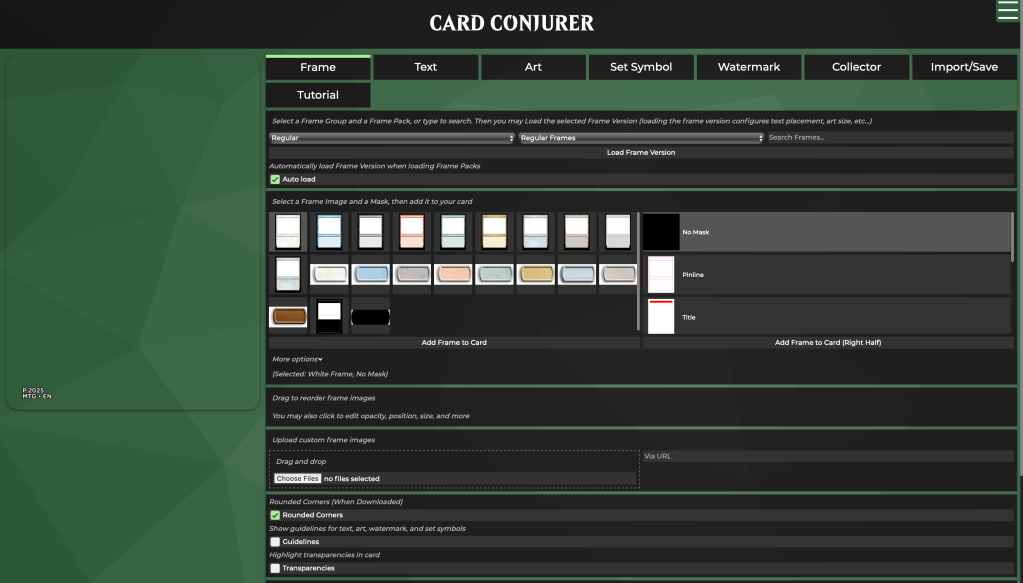
This completely free tool lets you build your card step by step, using the near-identical assets as official MTG cards. That means no need to manually recreate elements or awkwardly overlay new artwork onto an existing card; we’re actually constructing the design, layer by layer.
The coolest part? You can import existing cards directly onto your canvas. No more copying and pasting details from online descriptions; it’s all there, ready to edit.
My Process
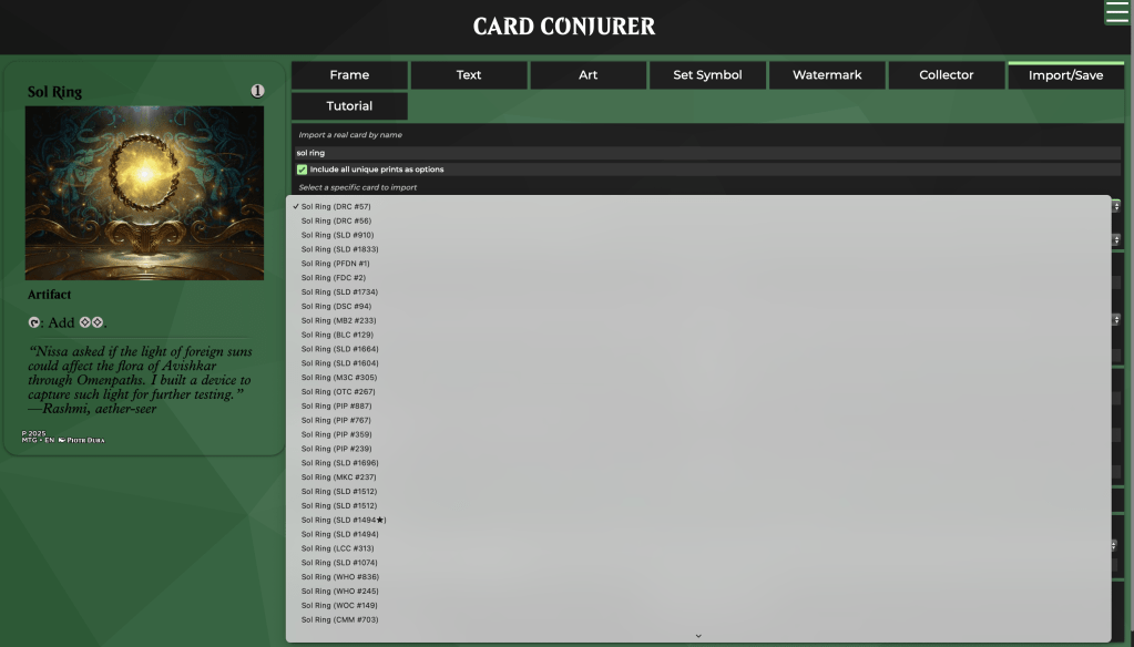
First, I navigate to Import/Save and lookup the card I’m designing. Select for import whichever style looks like a good starting point for your card.
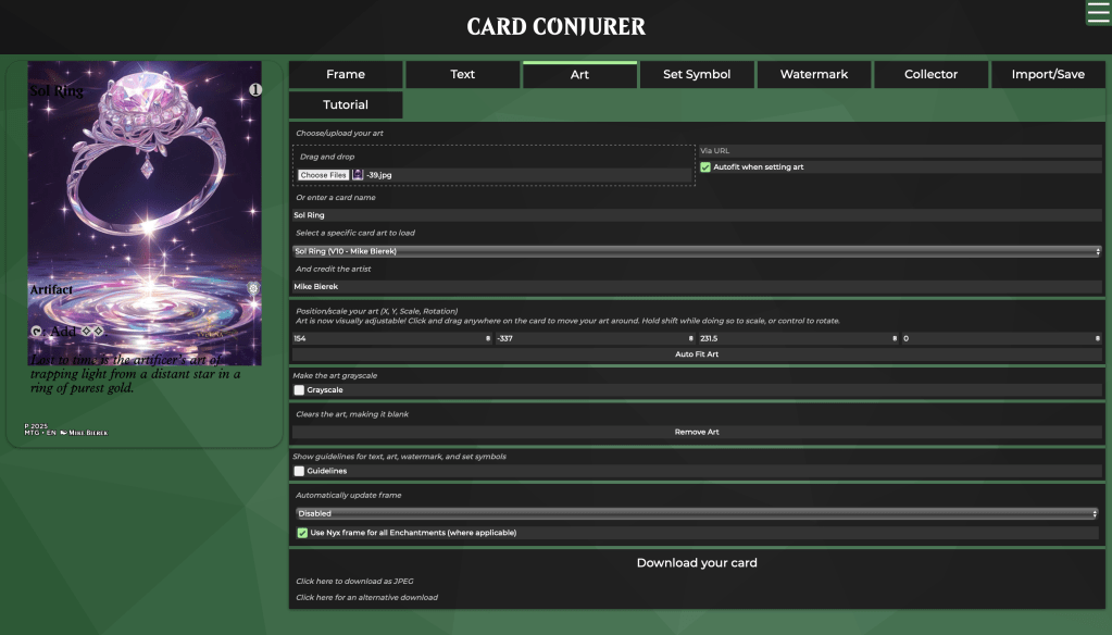
Then, I go to Art and upload a custom image.
Card Conjurer will help adjust this for you when you select a frame. On this screen, you can also manually adjust the art.
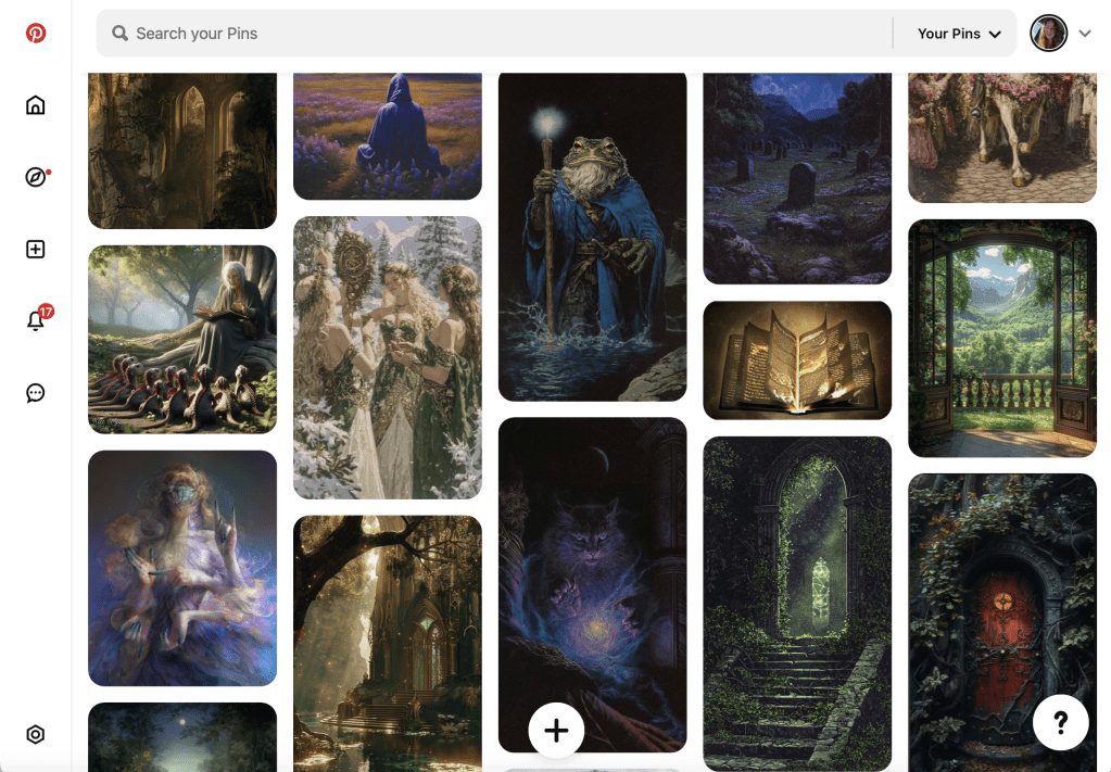
Tip: I keep a Pinterest board of art I want to use for MTG cards.
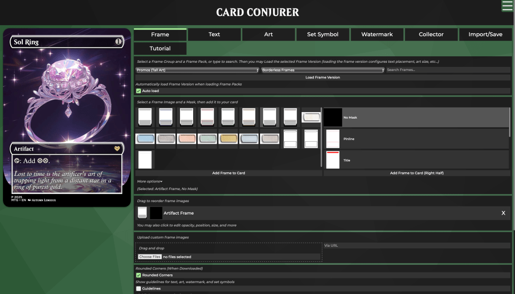
After uploading the image, I make adjustments and add finishing touches, such as the set symbol and flavor text.
To keep the design consistent with real MTG cards, I used a borderless Artifact frame
When the card is complete, I export the image and refresh the page to start another card.
Printing and Testing
Iteration 1
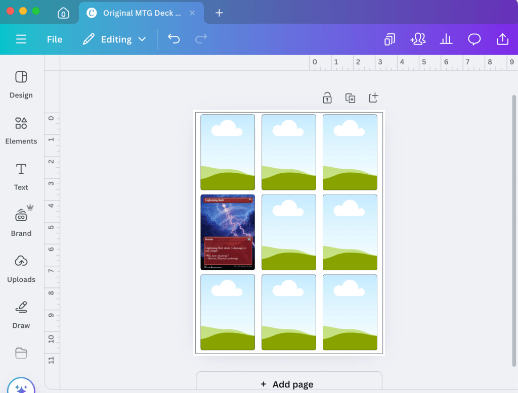
I first tried using Canva for a quick drag-and-drop template. The quality just didn’t meet my expectations. One downside with Canva is that I couldn’t create a frame in millimeters.
Initially, I aimed to produce nine cards per sheet to minimize waste. However, this strategy likely introduced some production challenges.
After testing the first round, I realized the cards were:
- Too thick
- Slightly too large
- A bit too rounded on the corners
- Often misaligned
These were issues that I aimed to fix in iteration 2. I considered reducing the number of cards per page, using Cricut’s print-and-cut function, and experimenting with a different cardstock.
Iteration 2
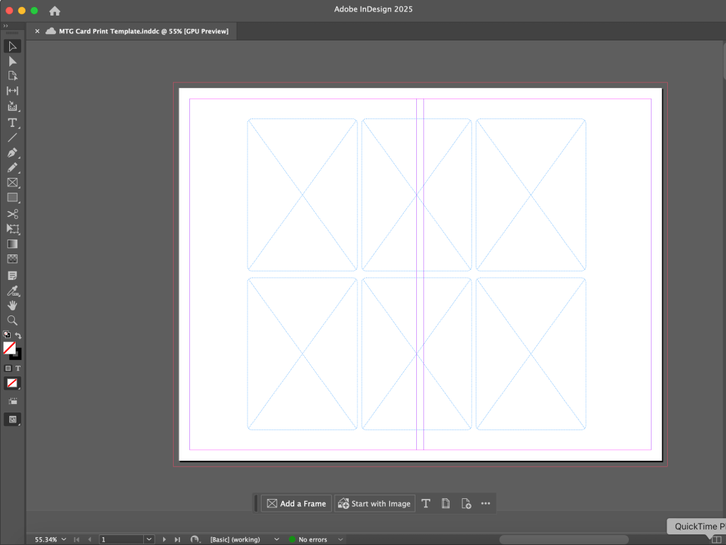
For my final template, I used InDesign to ensure precision and the highest possible image quality. This allowed me to create frames in millimeters and round the corners more accurately. I also reduced the number of cards per page from 9 to 6, focusing on quality over quantity.
This time, with less cards, I was able to use Cricut Design Space’s print then cut function. I also made sure to calibrate my machine before cutting the cards. The last important change was switching to a slightly lighter cardstock with a core.
I was amazed by the results—these were a significant improvement over the previous versions! In a sleeve, they looked and felt almost identical to a real card.
The biggest difference comes down to texture and rigidity. In a side-by-side comparison, my cards are more flexible than official MTG cards and lack the glossy coating. However, once sleeved, these differences became much less noticeable.
While my first “cardstock” was too thick, it was actually just heavy paper, which was lower quality, overly thick, and not the sturdy material I wanted. That led me to experiment with another genuine cardstock.
The Final Product
For the final product, I returned to the cardstock from iteration 1. While I initially had issues with printing and cutting, troubleshooting solved them, and once sleeved, the material felt the most like a real card.
Comparing versions


final cards vs. real mtg cards

Final Thoughts
I had a lot of fun with this project and learned so much along the way. From experimenting with different materials to fine-tuning the smallest design details, every step was a chance to improve my process.
It reminded me how much iteration matters—not just in custom card creation, but in game design and product design as a whole. Balancing aesthetics, functionality, and production constraints is a challenge, but also what makes the process so rewarding.
I’m excited to apply what I’ve learned to future projects, whether that means refining my techniques, testing new materials, or exploring different design approaches. If you’re thinking about making your own custom cards, I hope this breakdown helps! Let me know if you have any questions. Or if you’ve made your own, I’d love to see them.
Note: This content is for personal use, created purely because I love the game. I don’t profit off of these creations and it’s just for fun. Please check Wizard’s fan content policy for more information, and be mindful of usage rights in your creations!

You must be logged in to post a comment.