There are a million ways to create a portfolio website. I know from personal experience. Jokes aside, this website has gone through many iterations. Here’s what I learned along the journey.
Version 1
During my sophomore year of college in 2021, I took a class called Writing in Communities, where we were required to create a blog and upload our assignments as they were due. I was mortified. The idea of sharing my writing online—let alone anything personal—felt overwhelming. I had always been uncomfortable sharing vulnerable pieces of myself with the public.
Looking back, I realize that every artist faces this hurdle at some point. Though I wouldn’t use my first blog today, it taught me something valuable: how to create and put my work into the world.
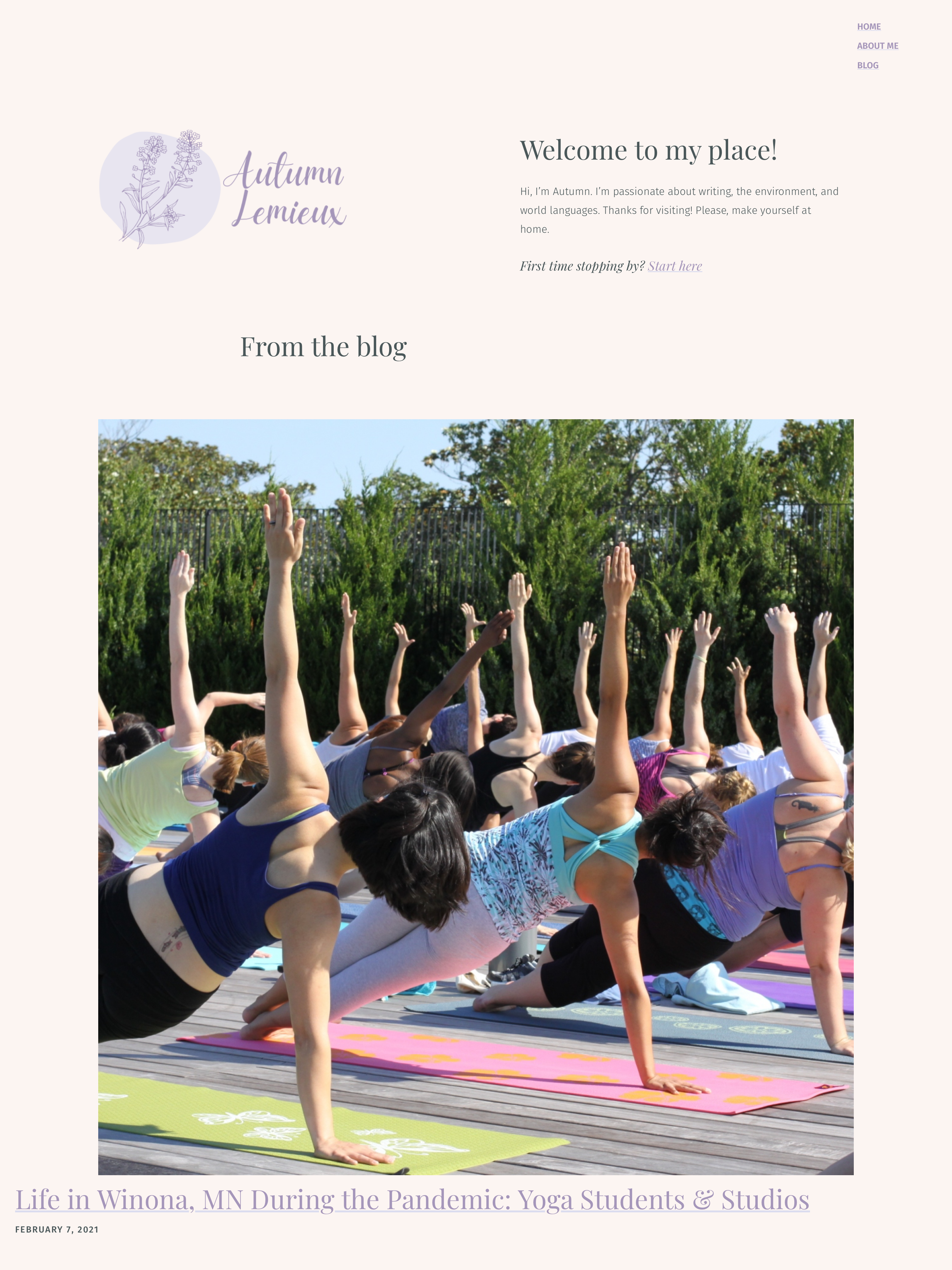
What I learned
- The first draft is for making it real.
- As a perfectionist, this website really tested me. I was caught in a cycle of constantly wanting to revise the design before even starting to write content.
- Design trends evolve.
- My website was much “cuter” in 2021, reflecting the trends of the time. I’ve learned that following trends can be valuable, but it should complement your goals, not define them.
- Building a website requires a skillset that takes time to acquire.
- I underestimated the time and effort needed to create a website that is both functional and visually appealing. It’s a learning process that requires patience and practice. Four years later, I’m finally building websites that meet the standard I’ve set for myself.
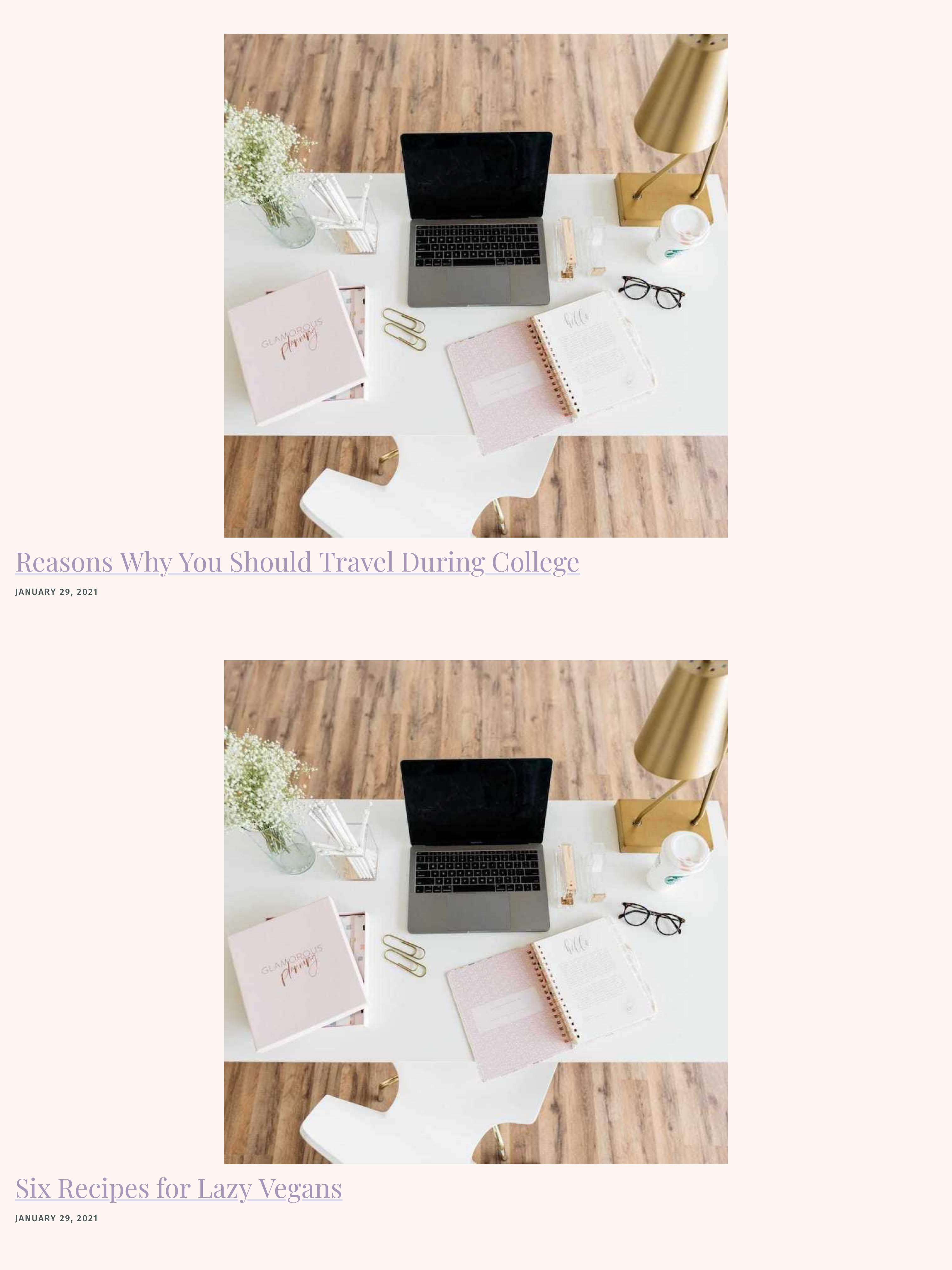
Version 2
After graduating, I decided to revamp my website. I worked on the initial updates while serving with AmeriCorps VISTA. In this iteration, I aimed to tell a clear and concise story about who I am and what I do. This led to a multi-column design with a simplified font and layout.
I began exploring features like a search function and tagging system to help viewers easily find the content most relevant to them. I also focused on defining the three core pillars of my work, which I identified as writing, design, and education at the time.
What I learned
- Progress often outweighs perfection.
- During the revamp, I realized that making progress is more important than waiting for everything to be perfect. It’s better to launch and iterate than to get stuck in endless revisions.
- User experience is key.
- I learned that focusing on the user experience is just as important as the design. A website that’s easy to navigate and intuitive can make a huge difference in how visitors engage with your content.
- Content is the foundation.
- I learned that no matter how polished the design, strong, clear content is what truly drives value. A website’s purpose should be reflected in its content first, with design serving to enhance it, not overshadow it.
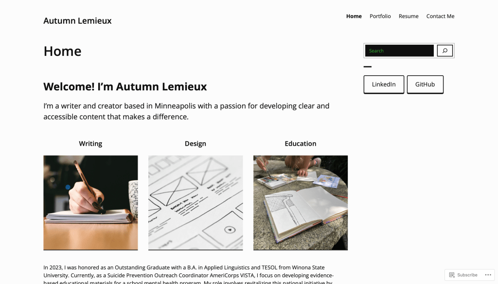
Current Version
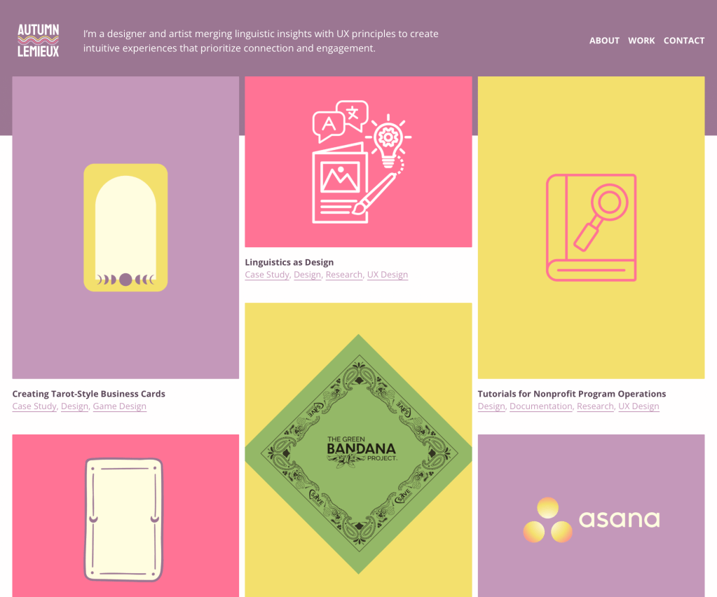
This iteration feels like a much truer reflection of my personality and best work. I stopped holding back from using color. I realized that if my designs didn’t reflect who I am, I’d be blending in with everyone else in this competitive field. I also took the time to deepen my knowledge of WordPress. Combined with my hands-on experience in digital design over the years, working on a variety of projects, I was finally able to create an iteration I’m truly proud of.
This time, I focused heavily on the user experience. Throughout the process, I kept asking myself, “How will users interact with this? Will they understand the labels? Is everything intuitive?” I wanted my website to feel as welcoming and magical as my work.
WHAT I’M LEARNING
- Authenticity is key.
- I learned that embracing my true self in design—not being afraid of bold choices like color—allowed my website to stand out and feel more genuine, rather than blending in with trends.
- Continuous learning is essential.
- I discovered that dedicating time to learning new skills—like expanding my WordPress knowledge—was crucial in creating a website that truly reflects my capabilities and vision. While I maintained similar elements from the previous version, like a three column layout, I made changes such as cleaning up navigation and increasing my visual-to-text ratio.
- Put the user first.
- I realized that a website isn’t just about aesthetics. Thinking from a user’s perspective, ensuring intuitive navigation and clear labels, made all the difference in making my site more accessible and engaging for visitors.
Future Goals
- Refine layout and images.
- My goal is to continue refining the layout of the website to ensure it’s as understandable and user-friendly as possible. This includes optimizing image sizes, improving their quality, and making sure everything aligns visually. I want the design to be both functional and aesthetically pleasing, ensuring that visitors have an enjoyable experience when navigating the site.
- Continue adding blog posts.
- I plan to keep adding new posts to the blog regularly. Whether it’s project updates, ideas, or lessons I’m learning along the way, I want the blog to stay fresh and give people a chance to see what I’m working on.
- Research accessibility standards and implement updates.
- I’m diving into accessibility to make sure my site works well for everyone. I’ll be researching and applying accessibility standards to improve things like color contrast, navigation, and compatibility with screen readers. My goal is to make the site as inclusive and easy to use as possible.

You must be logged in to post a comment.